Hi there! I'm Aneta
-
aneta
Hi! I'm Aneta, and I'm an experience designer and visual artist based in chicago.
--
VISUAL ARTIST
--
CHICAGO
--
EXPERIENCE DESIGNER

My name is Aneta Baran, and I’m a user experience designer based in Chicago, Illinois.
I design for interactions between users and digital interfaces with a focus on blended learning environments and identity. I currently attend DePaul University working towards a M.S. in Human Computer Interaction. I attained a B.S. in User Experience from DePaul University in 2017, and Masters in Human-Computer Interaction from DePaul in 2020. Go Blue Demons! Fulfilling minors in both Graphic Design and Information Technology during my time in school have allowed me to work with both design and development teams and have given me an understanding of both worlds.
Outside of my project work, I can be found looking for new media to consume (whether Japanese anime or classic Hollywood cinema) and exploring different art forms, my current obsessions being watercolor florals and scratch portraits.


Community Resource Page

01
USER RESEARCH / UX DESIGN / VISUAL DESIGN
Showcasing the opportunities and resources available to youth within Chicago's communities
Community Resource Page
01
USER RESEARCH / UX DESIGN / VISUAL DESIGN
Showcasing the opportunities and resources available to youth within Chicago's communities
01 BUILDING EMPATHY
User research: interviews, observations, competitive analysis, etc.
Comments and personal notes
02 DEFINING REQUIREMENTS
Definition: User personas, user stories
Comments and personal notes
The requirements for this project were drafted using insights from prior research conducted with members of Chicago's Austin community. Working with a researcher and fellow designer, I identified a set of user stories pointing to features that could be feasibly designed, tested, and implemented within our 6-week timeframe populated by data already existent within the system. The primary elements we decided to include were: (1) a prominent page title displaying the community name with an inviting graphic, (2) a list of upcoming opportunities in the area, (3) a list of organizations which provide activities in the community, and (4) call-to-actions nudging users to explore other areas of the platform.
Knowing our target users (community members and program providers) use a mixture of devices, creating a design that would be aesthetically pleasing across devices was a priority. Given the limited amount of elements on the page, I felt the design could value quality over quantity, so to speak. We conducted several short design sprints, gathering feedback from internal stakeholders as often as possible. As a final round of testing, we conducted a focus group with 10+ members of the Austin and Humbolt Park communities. This event served to validate the usability of our design and built excitement among the participants for such a feature.
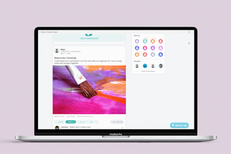
Youth Classroom UI

04
Guiding youth through a linear classroom curriculum in a hybrid learning environment.

check out other case studies


